Projects
What I’ve worked on over the years, including work at Google and side projects. More at GitHub.
Project IDX (now Firebase Studio)
2021 – 2025
I was a founding designer and engineer on Project IDX (now Firebase Studio), an experimental web-based development environment from Google. I led product and systems design, brand/identity, and contributed to product + internal strategy, technical architecture.
I also contributed foundational prototypes that shaped the generative AI and tool-integrations roadmap, and was a top-3 production eng contributor across AI (custom agent harnesses), frontend (Angular/React), IDE extensions, and infra (Docker).
I partnered closely with Monogram to design and build the Project IDX marketing site, including custom JS and CSS animations and more.
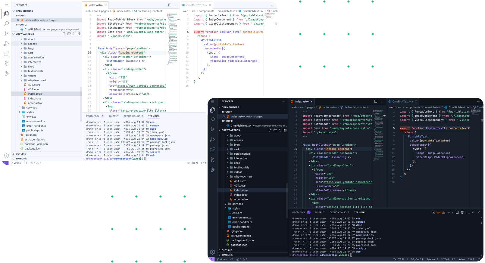
I built custom light and dark color themes, hand-crafted to balance foreground/background contrast with adjacent-token contrast in the editor. It's bold enough for our unique visual identity, yet restrained enough for the sustained use (hours per day) needed for a core editor experience. More details in my tweet.
Firebase
2015 – 2025
I was a design lead and manager on the Firebase UX team for many years, overseeing:
- The "Build" products (databases, web hosting, authentication, etc.)
- Core platform primitives (onboarding, billing, navigation, etc.)
- The Firebase console design system and brand visual language
Previously, I was an IC UX lead for Remote Config, A/B Testing, and designed much of the current console onboarding experience.
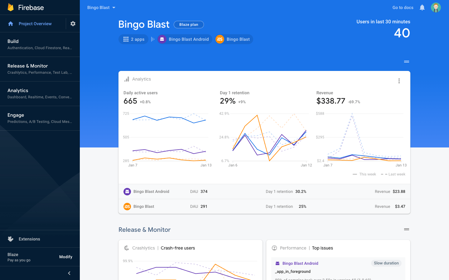
I've designed or overseen most of today's core Firebase console experience.
I've overseen most of our visual refreshes over the years. The latest (in 2019) was focused on accessibility.
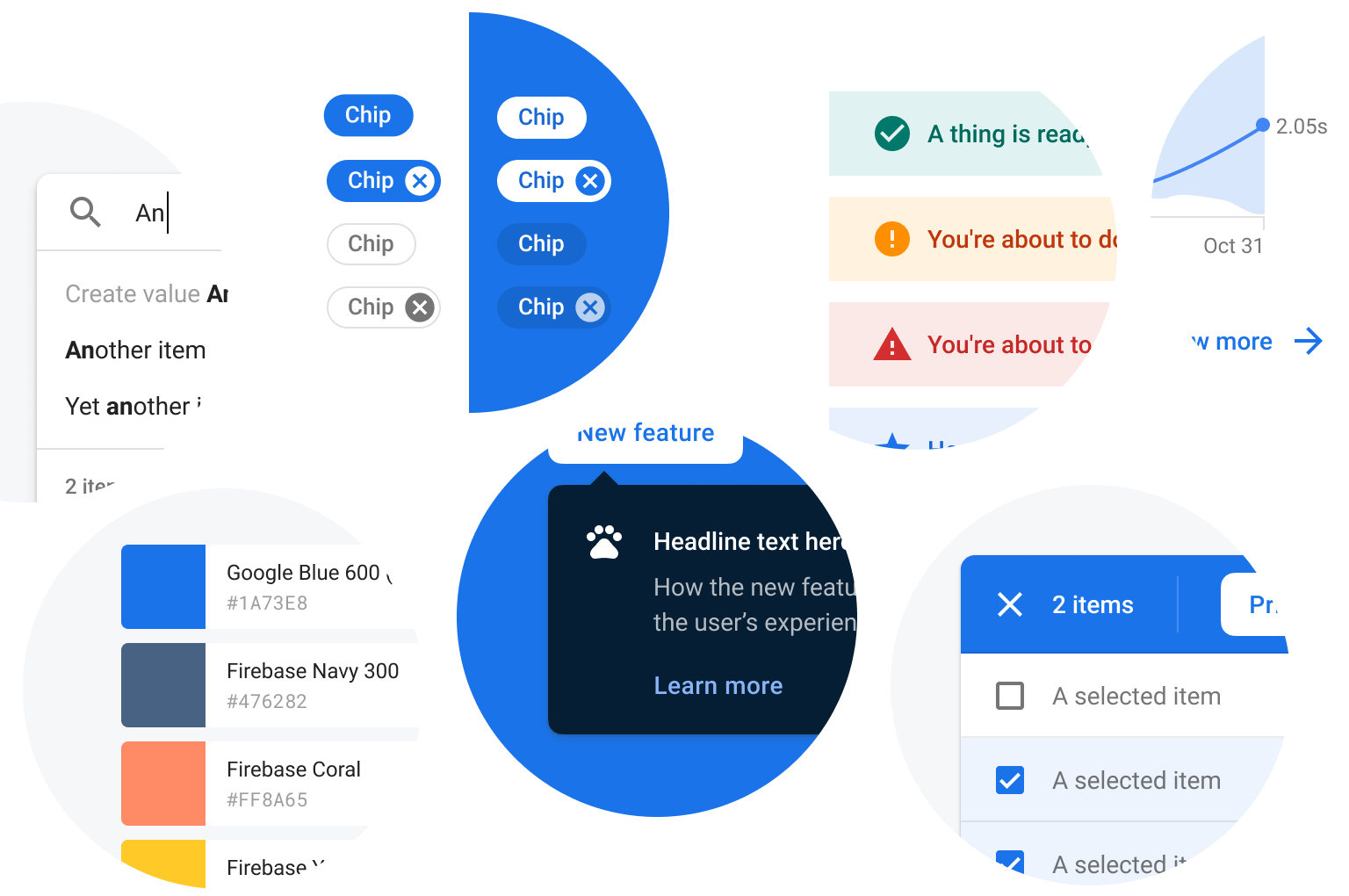
I've played a big role in design system adoption, expansion and refinement.
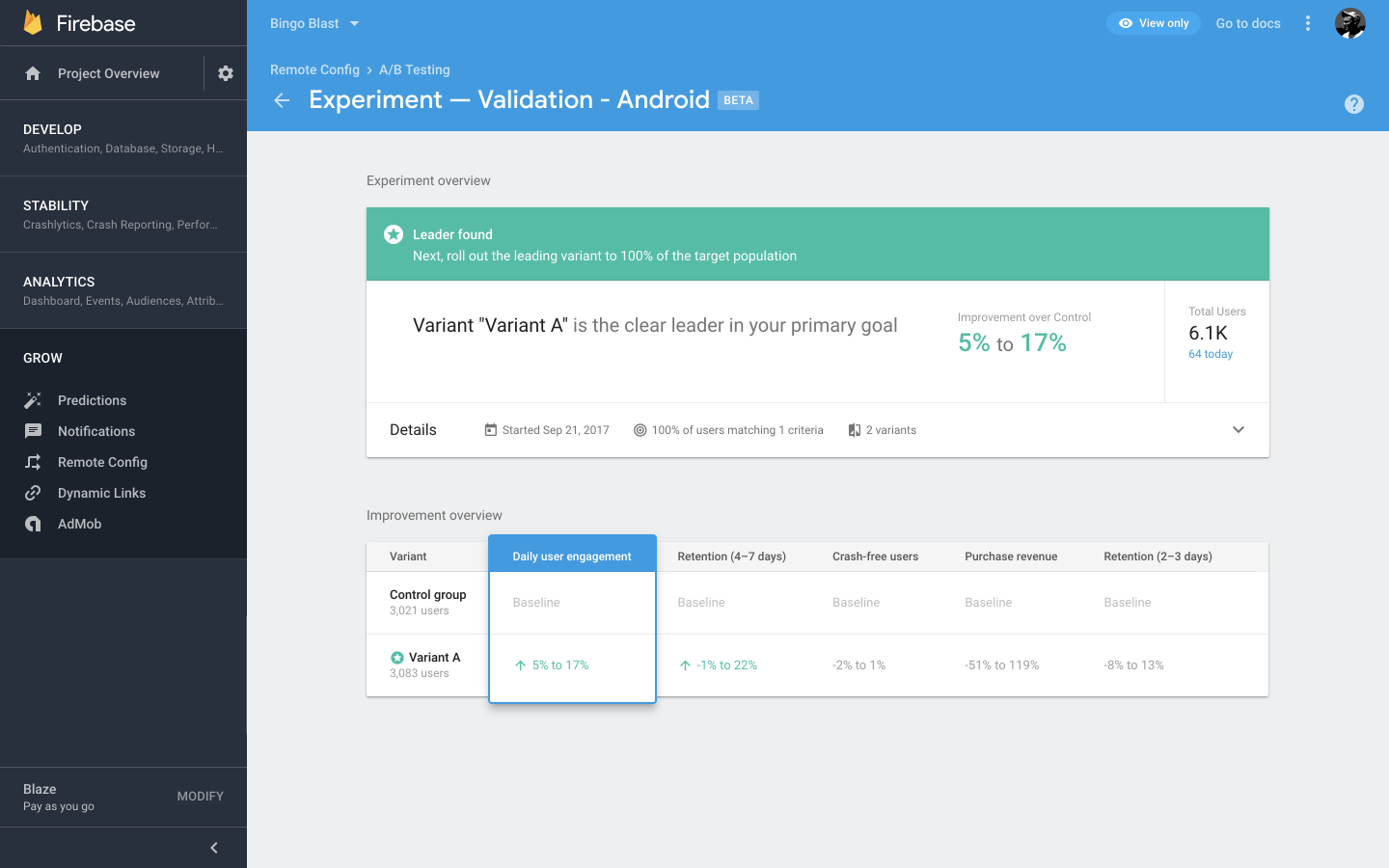
From 2015 – 2017, I was UX lead for Remote Config and A/B Testing, designing a novel product with little market precedent.
I had the opportunity to design and implement a few small-scale icon animations throughout the console.
Drew’s Art Box
2016 – Present
My wife runs Drew's Art Box, a business that ships art lessons in a box, right to your (and your kid's!) door.
I operate most of the tech behind the site, which is powered by:
- Astro and React+Vue for the shop
- Angular for the back office portal
- Google App Engine and Cloud Firestore for the backend
- tRPC API server
- Sanity.io for content management
The eCommerce site is powered by Astro and React+Vue, with a number of integrated payment platforms (Stripe, PayPal, and specialized ed-tech platforms)
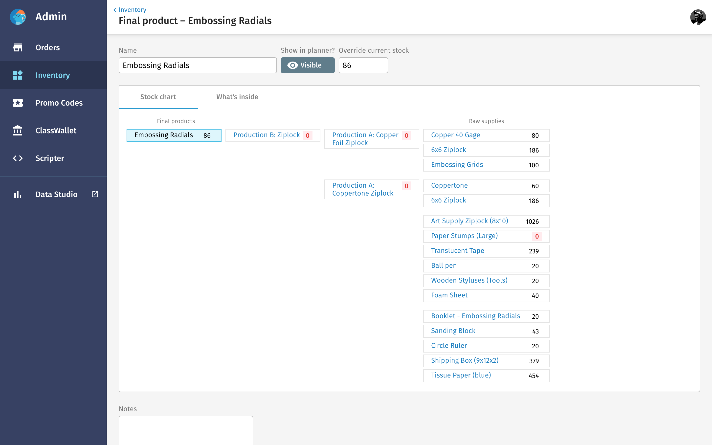
The back office portal is built on Angular and offers order management, inventory management, shipping, and more.
Some of the art lessons come with access to interactive digital apps that enable students to play with and reinforce concepts discussed in the videos.
IconKitchen and Icon Animator
2010 – 2021
One of my biggest passions is creating designer and developer tools. Since 2010, I've particularly been interested in tools that foster design creation for engineers and novice users.
In 2010, I launched the first version of the Android Asset Studio, which is still used by thousands of people today, and which I later revamped as IconKitchen. IconKitchen was the #4 product of the day when it launched on Product Hunt!
I also built the Android Icon Animator in 2016, which was an attempt to make simple icon animation accessible to any developer or designer. That tool later became the foundation of the more complete Shape Shifter icon animation tool by Alex Lockwood.
2021 – IconKitchen takes the guesswork out of designing app icons for Android, iOS, web apps, and more. Plug some values and it generates all the assets you need.
I'm particularly excited about IconKitchen's expressiveness despite having only a small set of customization options.
2016 – The Android Icon Animator was a foray into motion design tooling, and the genesis for the new and awesome Shape Shifter tool by Alex Lockwood.
2010 – The Android Asset Studio was the predecessor to IconKitchen and was later ported into Android Studio directly.
Styleguide
2019 – 2022
The Firebase team was using an old, clunky publishing system for documenting the "best practices" side of our design system. After considering alternatives available at the time (from Storybook, to Google Docs, to a one-off site), I decided to build something new.
Styleguide is a spec publishing system built with React that focuses on rapid publishing and easy maintenance, including features like:
- Markdown-based authoring + layout language, extensible through plugins
- Drag+drop or paste an image from the clipoard to upload.
- Simple collaboration + author management
- Robust redirect and shortlink support
I'm hoping to open source it someday.
The internal Firebase spec is maintained with this tool.
The tool extends Markdown heavily with side-by-side layouts and other block types.
Organizing content is incredibly fast thanks to drag'n'drop.
The page editor is built on the fantastic Monaco editor from VS Code, and includes change tracking and live preview.
Thanks to server-side drafts, authors can ask design system owners to review their changes before publishing.
MaterialColorsApp
2016 – 2021
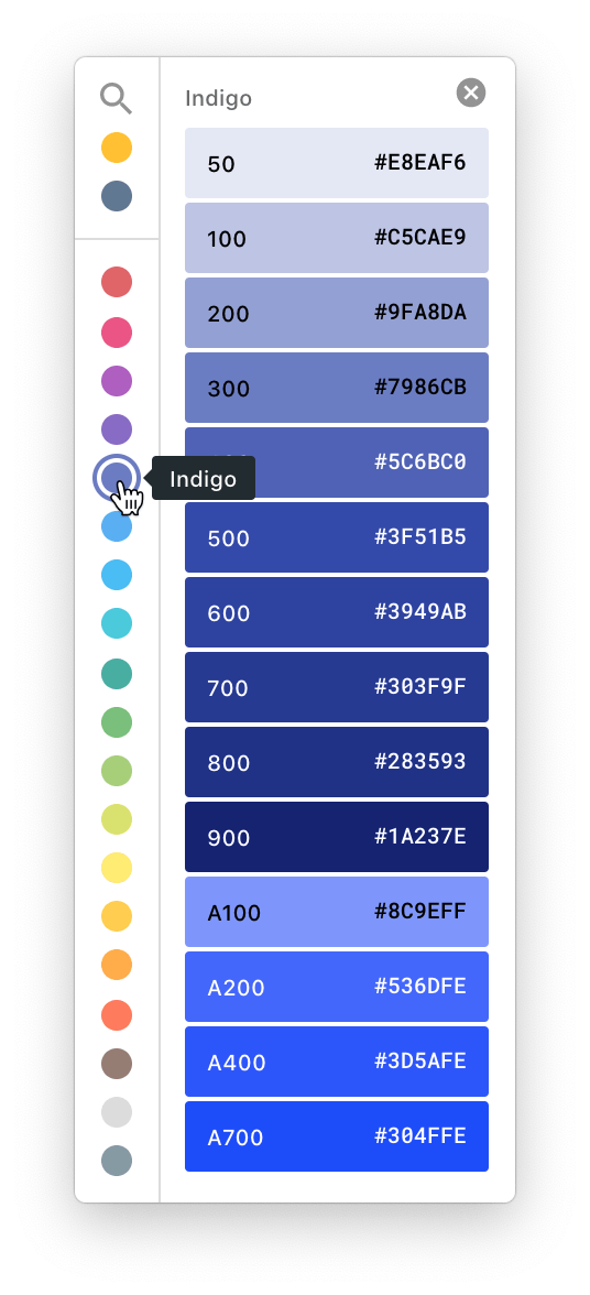
I built a tiny Electron app that lets you quickly reference the original Material Design color palettes. This was useful in the early days while our team used Sketch (which didn't have color styles), and remains useful for apps like Google Slides and Keynote.
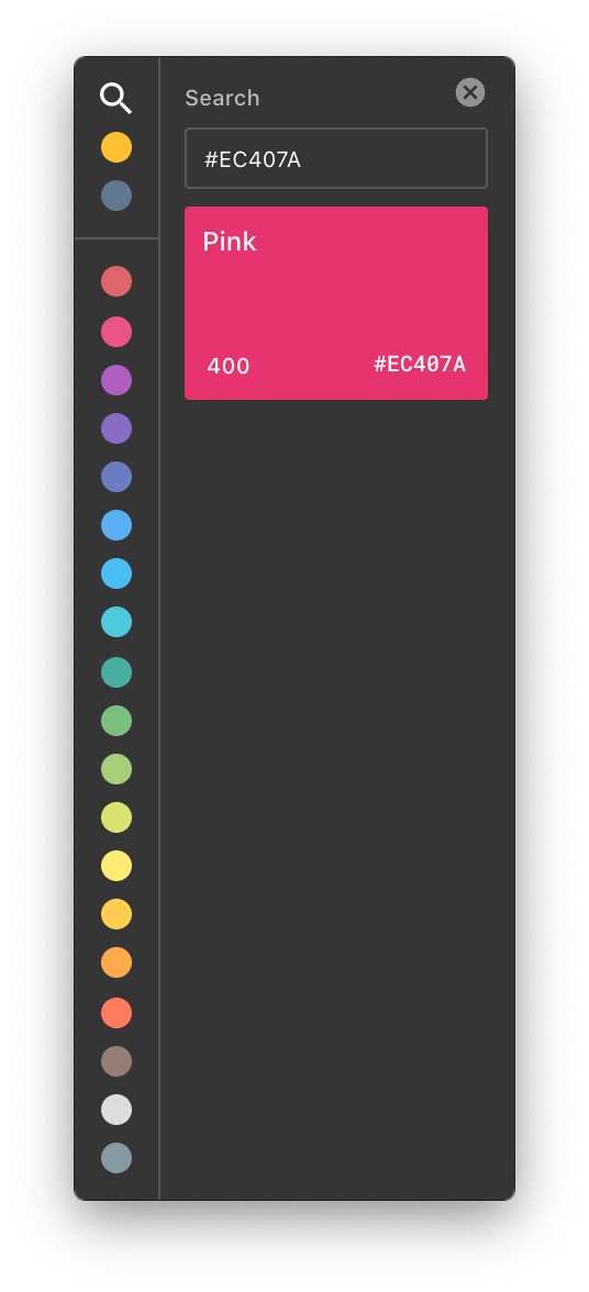
Over time more functionality was added, including dark mode support, fuzzy hex-code search (contributed by a colleague), and the [hidden] ability to bring in custom colors.
SlidesCodeHighlighter
2017
I used to do a lot of public speaking about tech (partiucularly Android), and a persistent issue was quickly highlighting code for use in decks. I wrote a tool to help with that, complete with custom themes, support for lots of languages, etc.
A more recent innovation was “highlight mode,” which was great for walking through different parts of the code across several slides.
ProtoKit
2019
As part of exploring a couple design system ideas my Firebase UX team was throwing around, I built a set of web components with StencilJS that made simple HTML-based prototyping really approachable (just drop a script tag and start prototyping!)
Hoping to open source these, or at least write more about the process, someday.
The playground was an interactive editor for playing with and quickly visualizing ProtoKit's web components.
I was particularly excited by this exploration into documenting color tokens. Particularly since semantic colors varied across 2 dimensions (theme, container type).
Stickers Plugin for Sketch
2018
I'm constantly on the lookout for ways to speed up my team's workflow. A constant struggle with Sketch (and Figma) stickersheets—particularly very large ones—is finding the example you need and dropping it into your design quickly.
To solve this, I built a plugin that indexes your Sketch libraries and provides a fast, searchable interface to find what you need and drag it into your design.
Before we switched over to Figma, the plugin became an essential part of the workflow, saving countless hours of time for the design team.
Other Plugins for Figma and Sketch
2017 – Present
I've written several plugins over the years—first for Sketch and now focusing primarily on Figma. I'm a big believer in building tools that help people work faster, and plugins are a great way to do that for designers.
A huge thank you to the Sketch and Figma teams for welcoming plugin development, as well as the wonderful developer communities that have formed and made writing plugins easy.
DataURL.app
December 2020
I wrote a little app that helps you make data URLs quickly.
It was an opportunity to try out Firebase Hosting Preview URLs, but also solved a painpoint I frequently experienced as a developer.
Muzei Live Wallpaper for Android
2013
My philosophy for design and developer advocacy is to create big, real-world demos and use them as fodder for content creation; walking the walk gives you more credibility.
Muzei is one of the larger apps I've written that epitomizes this philosophy. I came up with the idea for the app, designed, developed, launched, and open-sourced it over the course of 4 months.
Since the original launch, I updated some of the custom visual language in the app to include material design elements.
Muzei has been installed over a million times on Google Play.
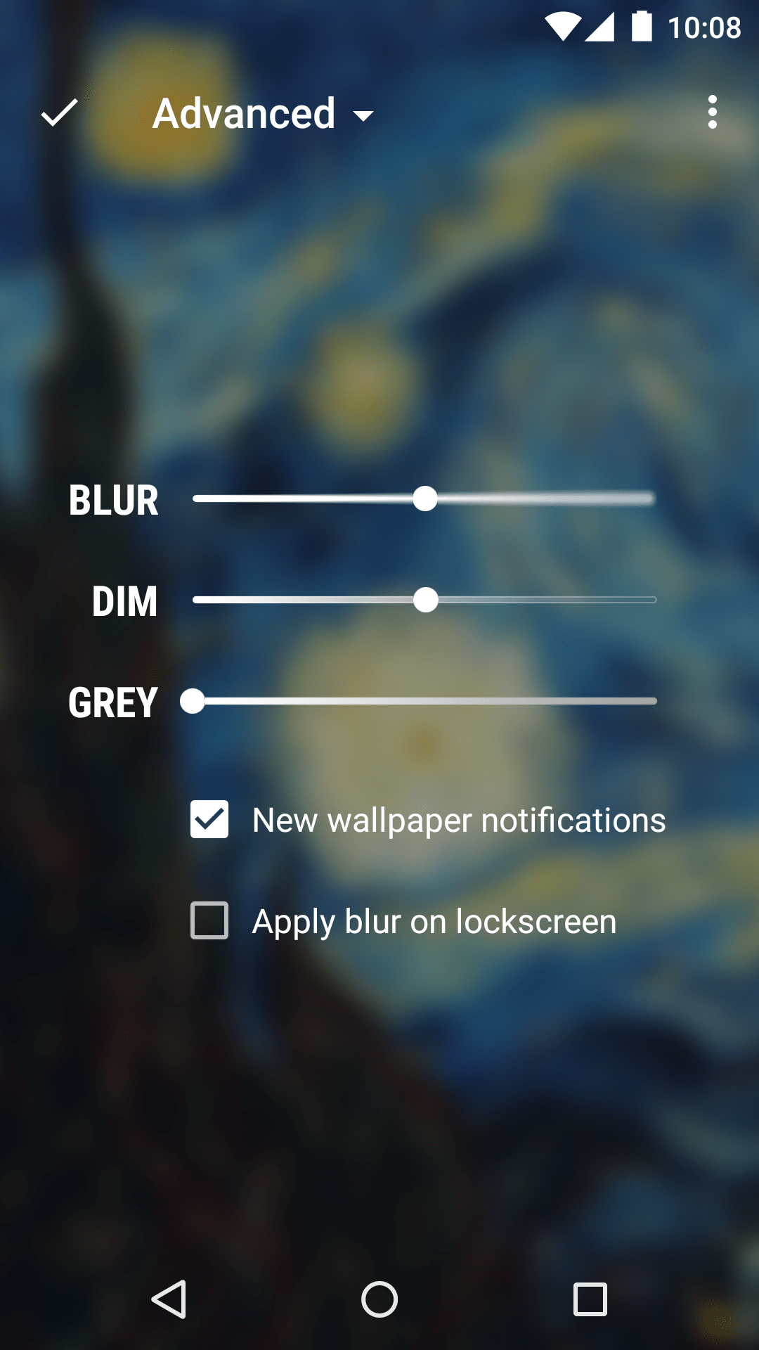
I obsess over details. Here's a screen in Muzei I'm really proud of, where the seekbars visually represent their corresponding effect. See on Dribbble
I also built a web-based archive of featured art used in the app, which actually served as the original basis of some of the interactions in this projects directory.
Google I/O Android App
2010 – 2014
The Google I/O Android app is a Developer Relations-run project that serves two purposes:
- Help Google I/O attendees and remote viewers personalize their conference agenda and explore conference content before, during, and after the event.
- Be an excellent open-source example of Android design and development best practices
My role has primarily been lead designer and frontend engineer, most notably for the 2014 app, which was one of the very first Android apps to adopt material design. For two years, I was also the overall technical lead for the app. In 2015, I acted primarily as UX mentor/advisor.
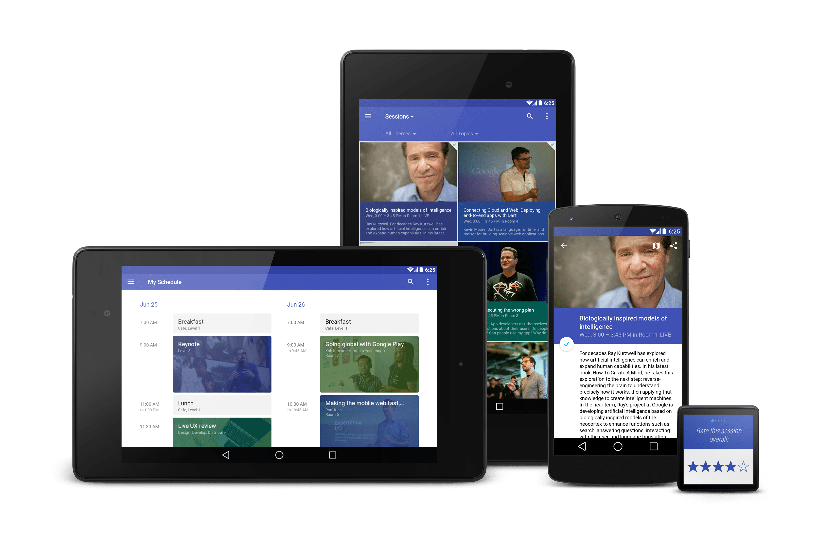
The 2014 app was one of the very first apps to adopt material design.
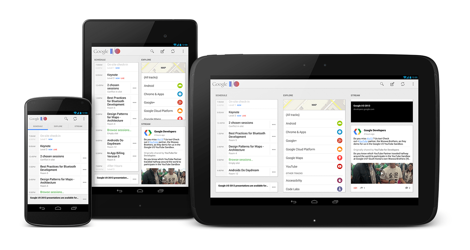
The 2013 app was one of the first to support 7-inch tablets for Android, helping light the path for Android tablet UI design.
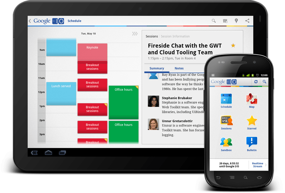
The 2011 app was one of the first to support the new tablet form factor with multi-pane UIs.
DashClock Widget for Android
2012
DashClock was my first published Android app and is exemplary of my philosophy for design and developer advocacy. It also promotes Android by exemplifying functionality that's only available on the Android platform.
I updated the app for material design shortly after the material launch at Google I/O 2014.
DashClock has been installed over 3 million times.
Other Design Tools
2012 – Present
Here are a few additional designer and developer tools I've built over the years.
2016 – The Layer Visualizer was a quick tool I built for helping teach material design, specifically the depth relationships of material surfaces. See on Dribbble
2013 – Android Design Preview was a tool I co-wrote that allows designers to get a more realistic view of their UIs by mirroring a portion of their computer screen to an Android device.
FORM Type Maker and Wear OS app
2014
I cofounded FORM, Google's first external design conference. I also built a web-based playground for FORM's custom typeface (created by the Material team). The app lets users type a message, choose a color, and create an animated GIF to share on social media.
Due to the conference's small size, the app was a key part of the social media strategy, ensuring those who couldn't attend could still participate.
I built a <canvas>-based glyph animation framework for the app. It was a great exercise in creative technology, and I learned a ton about modern web animation, performance, and more.
I also built a corresponding watch face for Wear OS and integrated it with Muzei.